BRIEF
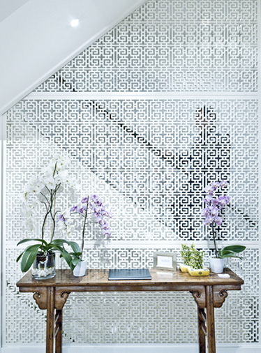
An antique store that hadn’t been refurbished in 20 years was in need of a more contemporary look, including a refresh of the company branding and to rationalize the building’s space plan, thereby increasing the gallery floor area.
CONCEPT
Contemporary but with a classic and timeless air.
SUCCESS STORY
Successful space planning lead to a 20% increase in gallery display space.
Amy designed this project during her time at SHH London


